Hipcamp: Usability Evaluation
PROBLEM: Hipcamp, a mobile app which allows its users to book reservations for campsites, was observing unsatisfactorily low conversion rates and high abandonment rates among its users. It was assumed that these issues were a result of poor usability.
GOAL: Improve usability of the Hipcamp app for its target user group in order to increase engagement and repeated use.
ROLE: UX Researcher/Designer, working with a team of 3 fellow Researcher/Designers.
SCOPE/CONSTRAINTS: We were allotted a term of 7 weeks to complete this project, were given no access to any existing internal data collected by Hipcamp itself, and were limited to remote correspondence with our team and participants due to the ongoing COVID-19 pandemic.
APPROACH: We first conducted a series of user interviews in order to understand the habits and needs of Hipcamp’s target users. Based on the insights gained from this research, we devised a usability testing protocol which reflected how these target users were likely to use the Hipcamp app. We then conducted a series of usability tests following this script, noting qualitative and quantitative observations and identifying existing pain points and opportunities for usability improvement.
RESULTS: Corresponding to the usability issues identified in our testing, we devised and delivered a series of specific design recommendations for improving usability of the Hipcamp app for its target users.
The project comprised of 3 phases:
1. User Research (2 weeks)
2. Draft Usability Test Protocol & Pilot Testing (2 weeks)
3. Usability Testing & Design Recommendations (3 weeks)
1. User Research
DEFINING TARGET USERS
Our first objective was understanding who Hipcamp's target users are. Lacking access to internal data, we used anecdotal observation to conclude that Hipcamp's target users:
🎂 are between 21 and 40 years old.
📍 live in either the US, Canada, or Australia.
⛺️ have experience or an existing interest in camping.
📱 regularly use a smartphone to access the internet (at least 3-5 times a week).
USER INTERVIEWS
Our second objective was then to understand Hipcamp's target users' needs. To do so, we planned and conducted a series of user interviews.
Interviewees were recruited through personal networks. Potential interviewees were asked to answer a number of screener questions designed to ensure that they represented Hipcamp’s target user group, and also that they would be willing to provide detailed and thoughtful responses to interview questions.
8 interviews were conducted in total. Due to safety concerns related to the ongoing COVID-19 pandemic, interviews were conducted remotely via Zoom. Each interview began with the interviewer obtaining verbal informed consent from the interviewee, as well as permission to record the interview for later review. The interview questions addressed a broad range of topics relating to the interviewee’s experience with and feelings towards camping, as well as their use of related apps, and were broadly structured into 5 sequential sections:
Warm-up: personal questions designed to spark conversation and get the interviewee thinking about the topic.
General issues: broader questions about the user’s habits and experiences relating to the Hipcamp app’s areas of functionality.
Deep focus: targeted questions about the specifics of interviewee’s experience with the Hipcamp app and its competitors.
Retrospective: closing questions which prompt the interviewee to think big-picture about everything previously discussed.
Wrap-up: an opportunity for the interviewee to share any final thoughts, comments, or concerns.
AFFINITY CLUSTERING ANALYSIS
After all interviews had been completed, each team member independently reviewed their recorded interviews and noted significant concepts, quotations, and patterns. Following this, our team combined all of these individual notes together and performed an affinity clustering analysis:
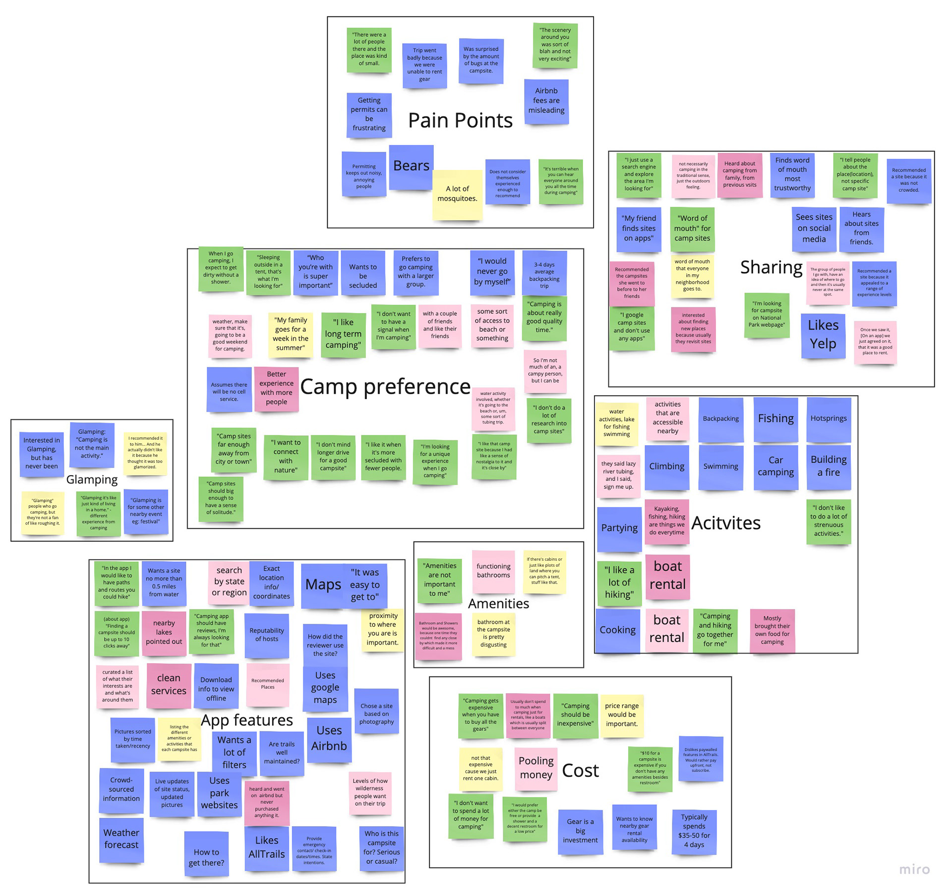
Tap to expand.
FINDINGS
The themes which emerged during our affinity clustering analysis lead us to identify 9 key insights about Hipcamp’s target user group:
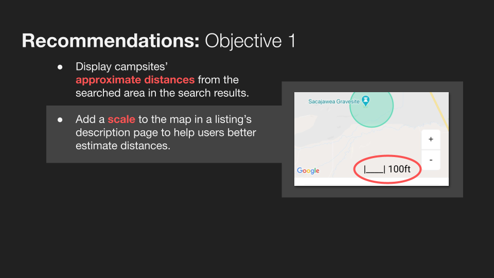
1. A campsite’s amenities were less important to users than its natural surroundings and proximity to points of interest
2. Users associated their greatest enjoyment of camping with the surrounding nature rather than in the campsite itself.
3. Users’ primary method of finding out about new campsites was word of mouth.
4. The majority of users preferred to go camping with a group.
5. The majority of users also expressed desire not to have to interact with other campers outside of their own party while camping.
6. Gear was widely cited as the most significant cost associated with camping, and availability of gear rentals was an important consideration for many users when planning a camping trip.
7. Users regarded “glamping” as having a separate appeal from traditional camping.
8. Most users’ reported camping pain-points arose from lack of preparation or insufficient information about their campsite being available beforehand, such as how many bugs would be present at a given time of year.
9. Users unanimously expressed desire for host transparency and up-to-date information about a campsite so that they can prepare accordingly.
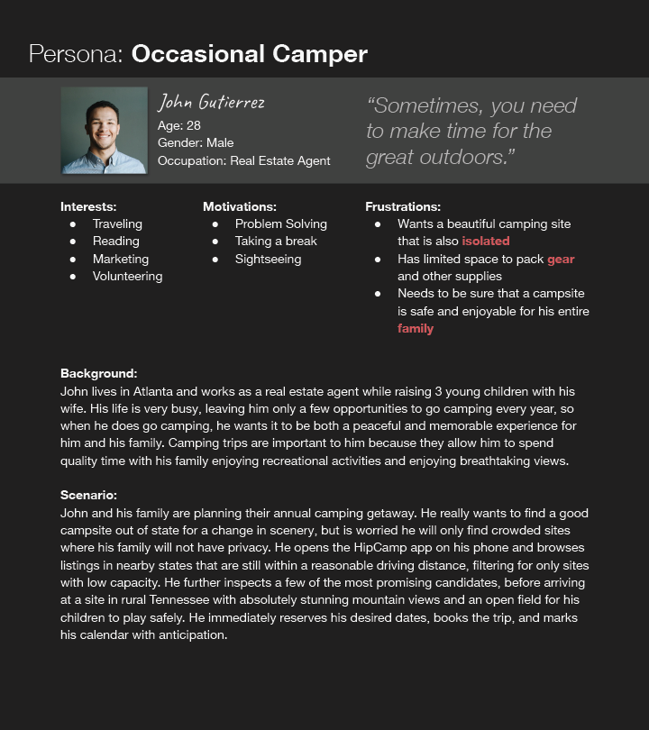
PERSONAS
In order to more effectively communicate our findings to stakeholders, we synthesized these insights into 3 user personas, each representing a distinct subgroup of Hipcamp’s target users which would be necessary to consider when redesigning the app’s user experience. In addition to biographical information, each persona was also accompanied by a user scenario communicating the specific tasks each user was likely to perform within the Hipcamp app.
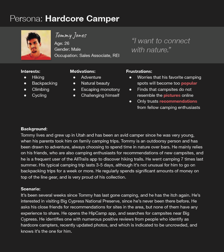
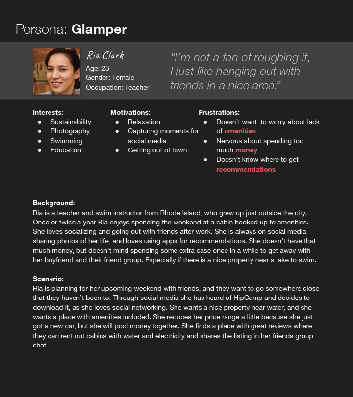
Tap to expand each persona.
2. Draft Usability Test Protocol & Pilot Testing
TEST OBJECTIVES
Having gained an informed understanding of who Hipcamp's target users were, as well as what they needed from the app, we were ready to conduct a series of usability tests to identify any outstanding usability issues inhibiting its effectiveness at meeting those needs. We defined 6 test objectives relating to how user needs should be met by the app's features.
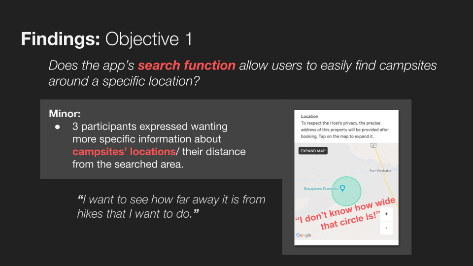
1. Does the app’s search function allow users to easily find campsites around a specific location?
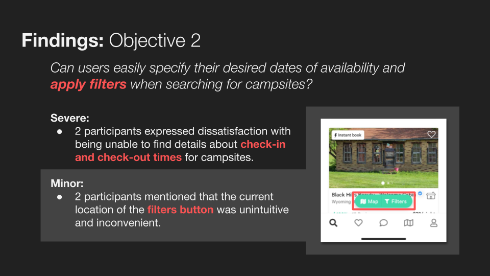
2. Can users easily specify their desired dates of availability and apply filters when searching for campsites?
3. Are users able to add campsites to a favorites list?
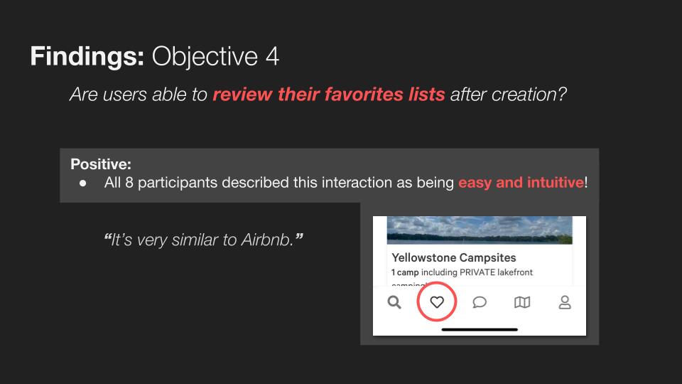
4. Are users able to review their favorites lists after creation?
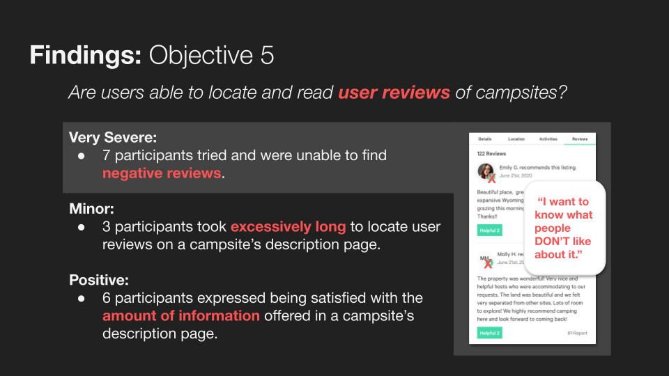
5. Are users able to locate and read user reviews of campsites?
6. Are users able to navigate the steps necessary to book a campsite?
TEST PROTOCOL
With those objectives defined, we could then draft a protocol for conducting usability tests. Tests would once again be conducted remotely via Zoom. Test participants would be asked to dial in to a Zoom call from both their webcam equipped computer and their mobile device, and to share their mobile device screen for the duration of the test so that their in-app actions could be directly recorded. All tests would follow a defined testing script. The script was broken down into 4 sections:
Introduction, in which the test moderator introduced themselves and the testing process and received verbal informed consent from the participant to record the testing sessions for later review and analysis.
Preliminary interview, which was intended to break the ice with the participant and get them thinking about camping and the context of the Hipcamp app.
Tasks, which consisted of use scenarios prompting the participant to interact with the app while narrating their actions and thought process.
Final wrap-up, a series of general questions about the user’s experience using the app, their overall impressions of the app, their perceived interest in using the app in the future, and any other final thoughts.
EVALUATION MEASURES
Moderators would make notes of qualitative observations while conducting the tests, as well as afterwards while reviewing test recordings. These notes, combined with participants' recorded responses to probe questions during the tasks phase as well as wrap-up questions, would form the basis of our final qualitative research findings.
Additionally, moderators noted quantitative observations relating to the following metrics:
⏱ Completion time of each task
❌ Number of errors made during each task
👍 Reported level of satisfaction upon completion of each task (expressed on a numeric scale from 0 to 3)
PILOT TESTS
Before conducting usability tests with participants from Hipcamp's target user group, we conducted a series of 4 pilot tests in order to validate our testing protocol/script and identify any opportunities for improvement. Pilot test participants included fellow design students as well as personal friends, recruited informally through word of mouth.
Pilot testing exposed an issue with our initial test script which led to users being presented with a confusing edge case (an unbookable campsite).
LESSONS LEARNED & PROTOCOL REVISIONS
Conducting preliminary pilot tests with our draft test protocol proved invaluable, as it allowed us to catch several significant issues with the initial script and make appropriate revisions in order to address them before they could negatively impact any of the tests we would conduct with Hipcamp's target users. The most significant of these revisions were:
🩹 Numerous changes made to the task portion of the test script based on observations that participants spent much longer on on some tasks than others, and had trouble remembering long lists of steps.
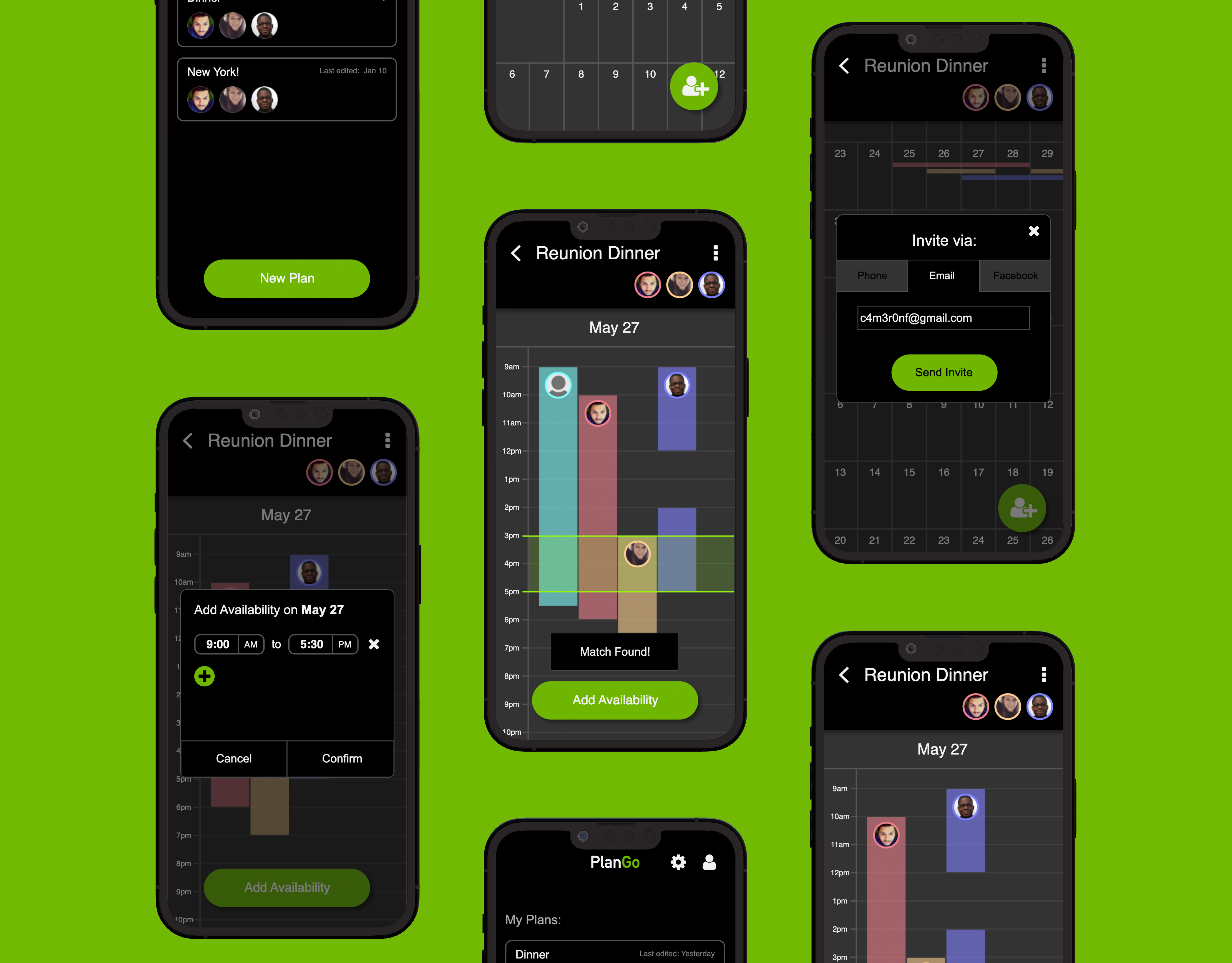
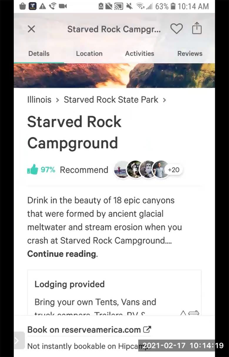
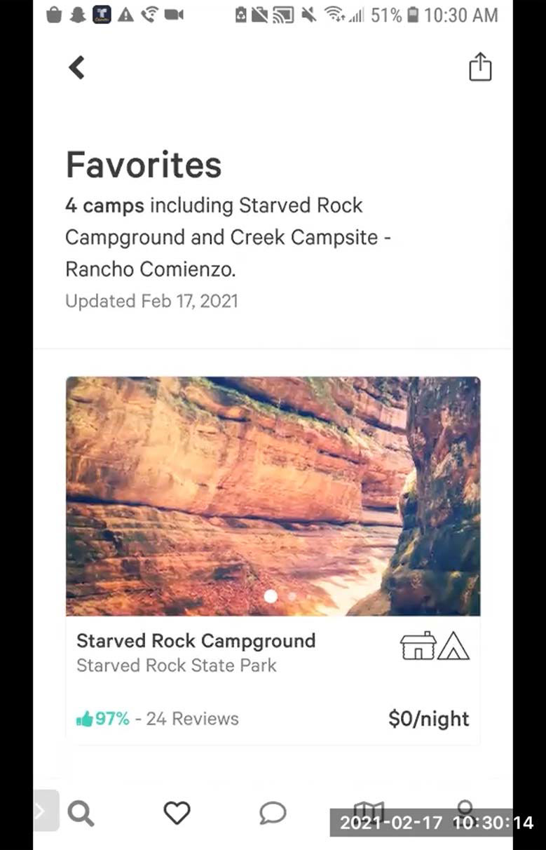
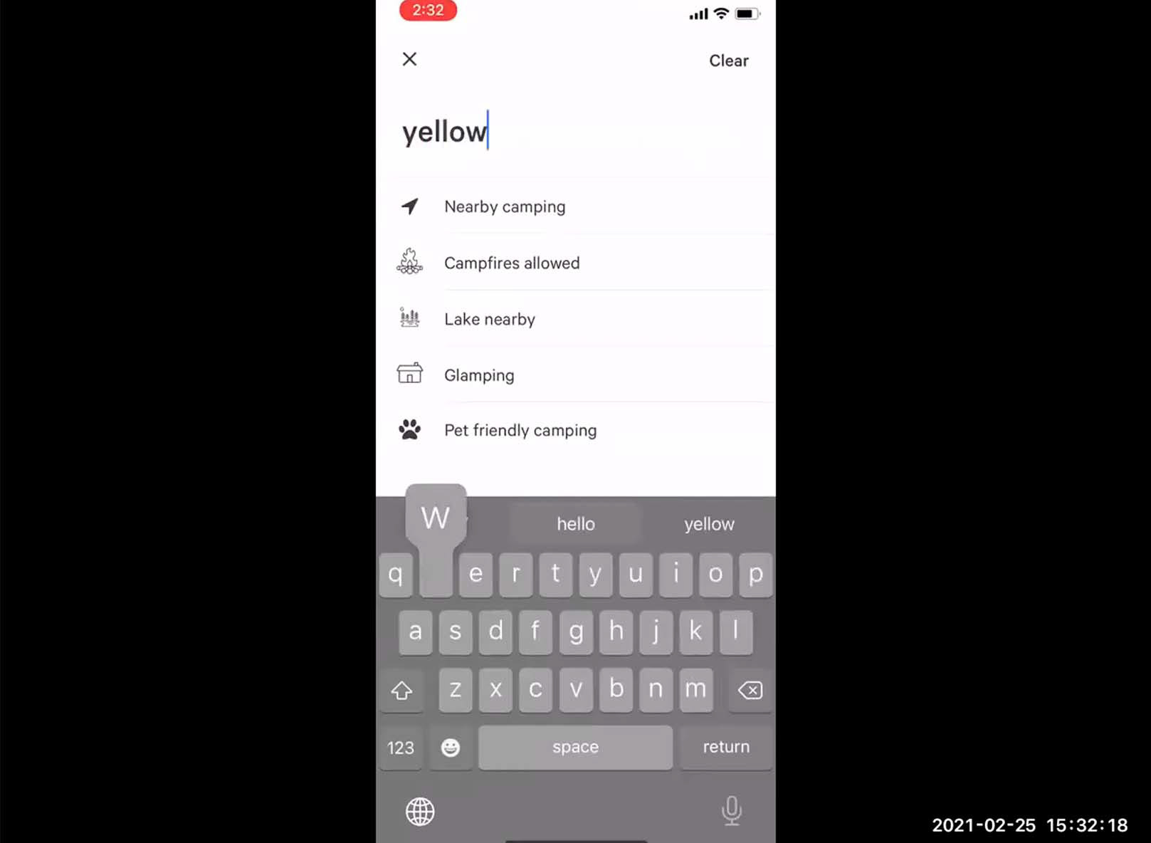
🩹 The camping location provided the test scenario, originally Starved Rock State Park, being changed to Yellowstone National Park based on observations that the name of one of the first search results for Starved Rock State Park in the Hipcamp app caused confusion for participants (see above image).
🩹 Questions in the wrap-up interview being changed based on observations that the original questions often elicited responses largely redundant with information already provided in earlier sections.
🩹 A new question being added to the wrap-up interview, inspired by our experiences as pilot participants in other research groups’ usability tests.
3. Usability Testing & Design Recommendations
USABILITY TESTS
8 usability tests were conducted with participants from Hipcamp’s target user group recruited through personal networks. Tests followed an updated test protocol reflecting the changes identified during pilot testing.

A usability test in progress. Please excuse my hair, it was peak quarantine. 💀
QUANTITATIVE FINDINGS
The insights yielded by our quantitative observations during our usability tests proved limited. Completion time in particular didn't seem to describe anything about the app itself so much as the arbitrary length of our scripted tasks, and seemed to have been an altogether ill-conceived metric. Number of errors and reported satisfaction were, perhaps unsurprisingly, inversely correlated.
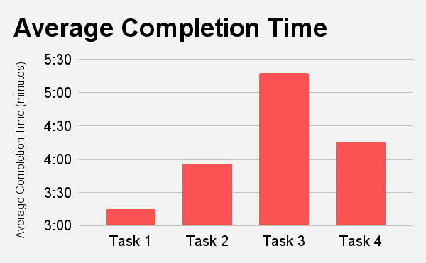
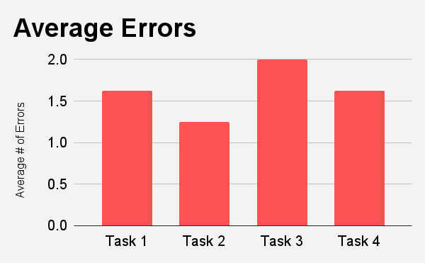
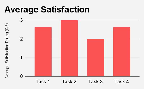
Tap to expand each histogram.
AFFINITY CLUSTERING ANALYSIS
After all tests had been completed, we again combined our individual qualitative observation notes to perform an affinity clustering analysis:
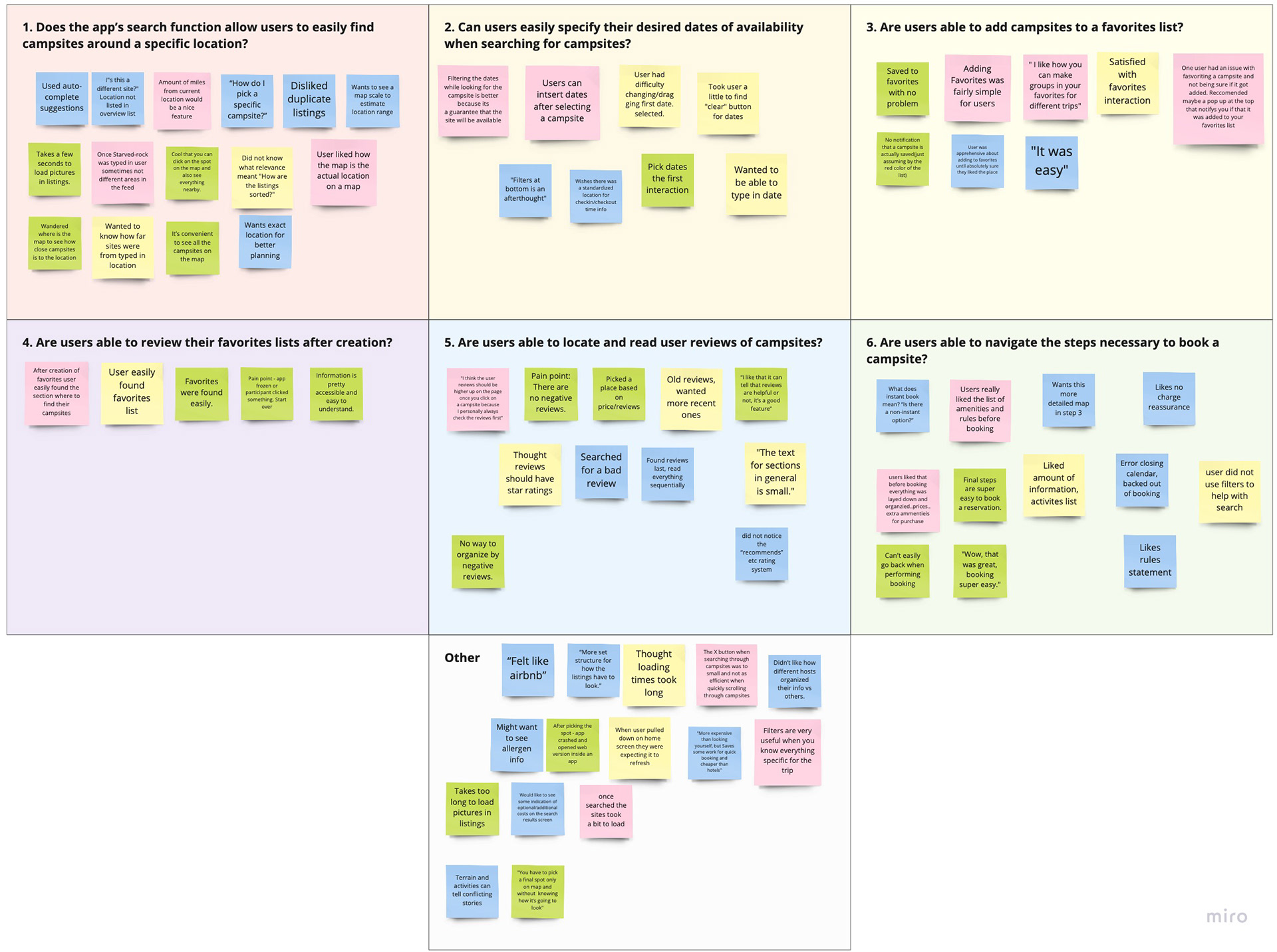
Tap to expand.
QUALITATIVE FINDINGS
Each key finding which emerged from the affinity clustering analysis was additionally assigned one of the following subjective severity ratings intended to reflect its relative priority for being addressed in future revisions of the app:
🤬 Very Severe
☹️ Severe
🤷 Minor
🥳 Positive
The assignment of these ratings was based on consideration of multiple factors, including:
⚖️ Degree to which the finding impacted users’ satisfaction.
🎳 Percentage of users the finding impacted.
💲 Potential feasibility or cost of addressing the finding.

Tap to expand each finding slide.
DESIGN RECOMMENDATIONS
Based on the usability challenges identified in our findings, we recommended the a series of corresponding design changes to be made to the Hipcamp mobile app in order to improve usability for its target user group:


Tap to expand each recommendation slide.
SUMMARY OF MOST SIGNIFICANT FINDINGS & RECOMMENDATIONS
🤬 Very Severe
❌ Finding: 7 participants tried and were unable to find negative reviews.
✅ Recommendation: Add a sorting options dropdown at the top of the reviews section to allow users to sort reviews in a variety of ways including: positive first, negative first, most recent, most helpful, etc.
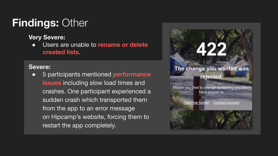
❌ Finding: Users are unable to rename or delete created lists.
✅ Recommendation: Add an option for users to rename or delete created lists.
☹️ Severe
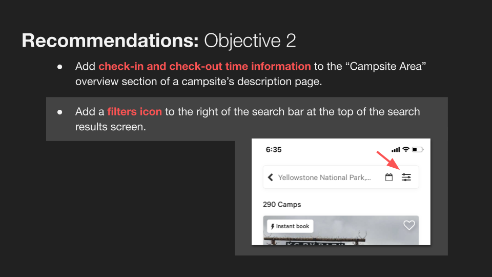
❌ Finding: 2 participants expressed dissatisfaction with being unable to find details about check-in and check-out times for campsites.
✅ Recommendation: Add check-in and check-out time information to the “Campsite Area” overview section of a campsite’s description page.
❌ Finding: 2 participants described the interaction for selecting lists to add campsites to as being confusing with regards to whether they were adding the campsite to a list or removing it.
✅ Recommendation: Deliver feedback in the form of an informative pop-up message with the text “added to [list name]” when selecting to add a campsite to a list.
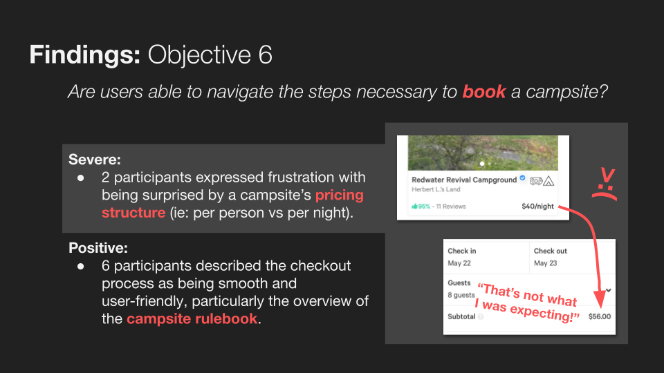
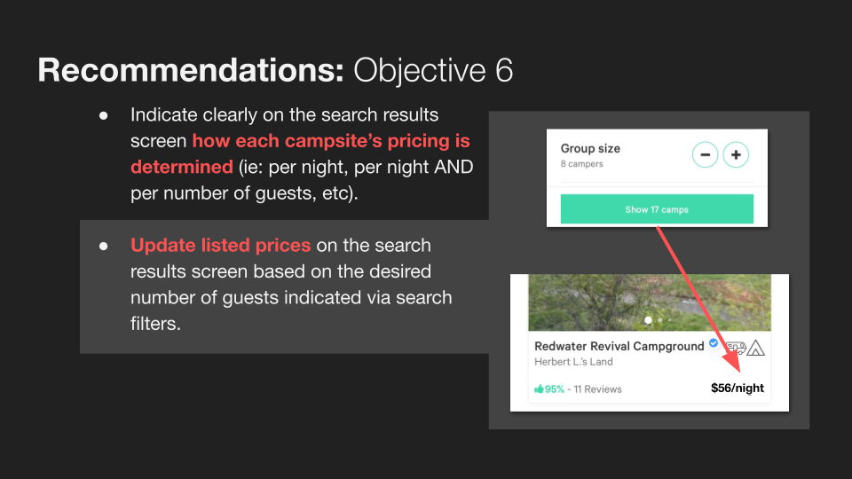
❌ Finding: 2 participants expressed frustration with being surprised by a campsite’s pricing structure (ie: per person vs per night).
✅ Recommendation: Indicate clearly on the search results screen how each campsite’s pricing is determined (ie: per night, per night AND per number of guests, etc). Update listed prices on the search results screen based on the desired number of guests indicated via search filters.
❌ Finding: 5 participants mentioned performance issues including slow load times and crashes. One participant experienced a sudden crash which transported them from the app to an error message on Hipcamp’s website, forcing them to restart the app completely.
✅ Recommendation: Conduct further inquiry into crash reports.
Reflections
Overall, I consider this usability evaluation exercise to have been a resounding success 🎉, as it accomplished its goal of producing a list of specific recommendations for improving the usability of the Hipcamp mobile app for its target user group supported by rigorous user research.
With that said, there are some things I'd do differently next time:
📝 Our protocol for recording quantitative observations, tied to tasks rather than test objectives, proved ineffective and produced relatively few significant findings. In future usability tests, I will plan to collect quantitative data pertaining instead to test objectives.
📝 Though no test participants expressed dissatisfaction with our usability testing protocol directly, 6 participants mentioned in wrap-up interviews that they would be unlikely to use the app in the specific manner our testing script directed. It is difficult to say whether this discrepancy in expectations might have impacted our findings, but regardless, more mindful probing in pilot tests likely would have caught this error.
📝 I believe that our test script's lack of specifically addressing Hipcamp's search filter functionality constitutes a failure to meet our 2nd test objective, and a missed opportunity to gain additional valuable insight relating to the usability of those features.
📝 Finally, I regret not using this project as an opportunity to gain experience with a dedicated usability testing software such as UserTesting. Such experience would no doubt prove invaluable for future projects as well as job/internship applications. However, the financial/contractual barriers to using this software as a student proved too inconvenient in this case.
Thanks for reading! ❤️