PlanGo: A Tool for Making Plans
PROBLEM: Comparing the availability of multiple participants in order to plan meetings and events is a difficult and complicated process which often either makes excessive demands of the planner’s short term memory or requires the use of apps or platforms not designed to support this task.
GOAL: Design a solution which improves the experience of sharing and comparing participant availability information in order to plan a meeting or event.
ROLE: UX Designer
SCOPE/CONSTRAINTS: I was allotted a period of 3 weeks to complete this assignment. Due to this limited timeline, preliminary user research was not possible. It was assumed that the solution to the problem would best take the form of an app or website.
APPROACH: I began by identifying target users and devised a series of assumptions about their preferences which would inform the design of my solution. Based on that information, I defined a list of functional requirements as well as UX goals by which to determine whether my solution fully addresses the problem. Having determined that my solution would take the form of a mobile app called PlanGo, I started my design process by laying out its architectural structure, and then moved on to designing an interface informed by a variety of design principles.
RESULTS: A mid-fidelity digital prototype of the PlanGo app demonstrating its core functionality and user experience.
The project comprised of 2 phases:
1. Planning (1 week)
2. Design (2 weeks)
1. Planning
DEFINING TARGET USERS
As time did not allow for research to be conducted, the target users for my solution were arbitrarily defined and expressed using 2 user personas:
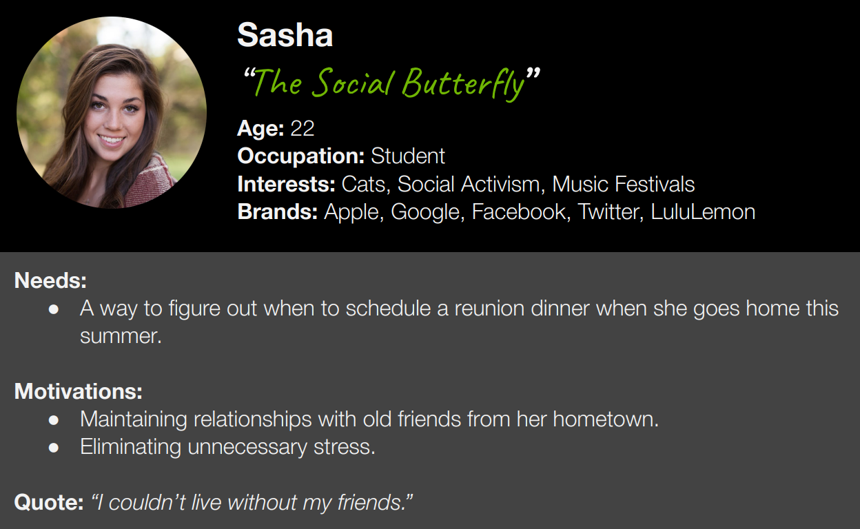
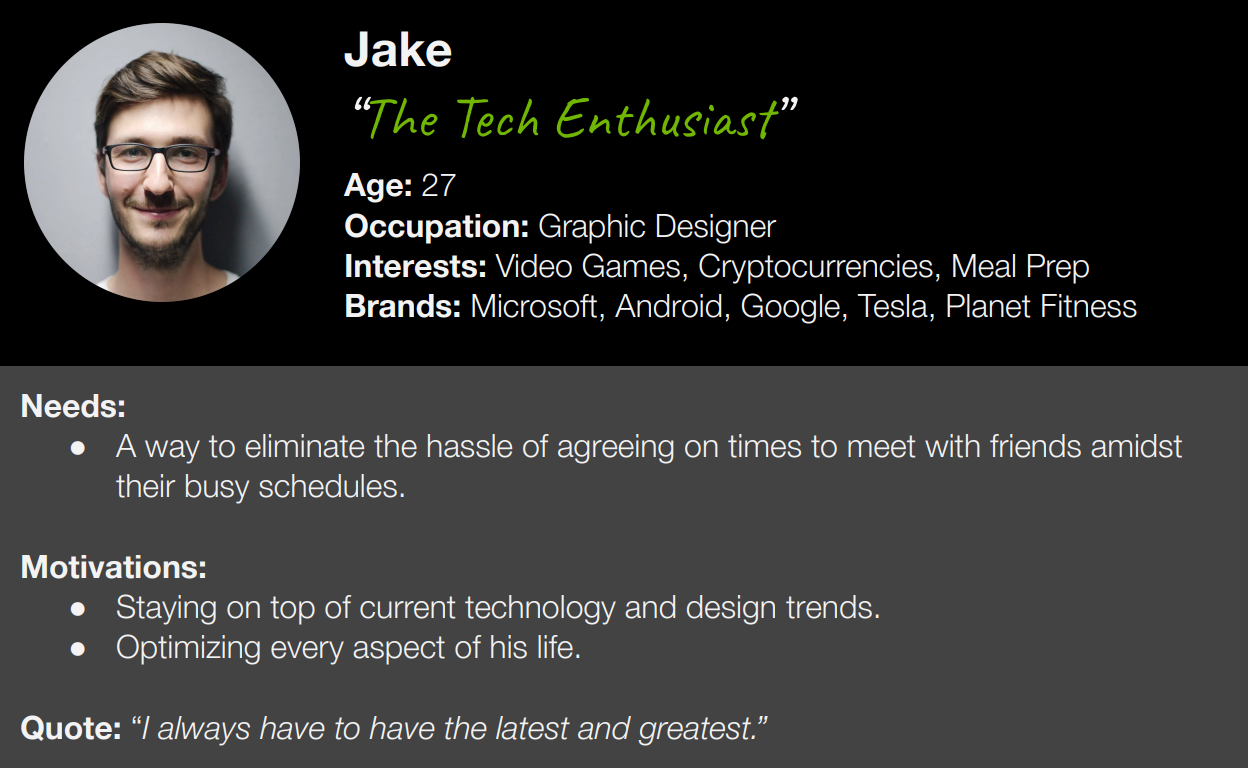
Tap either persona to expand it.
ASSUMPTIONS
Based on these defined target users' lifestyles and brand affinities, I determined that the best form for my solution to take would be a mobile app. In addition, I defined 3 key assumptions about how my target users would want to use the app:
1. Users’ experiences with the app will begin after a tentative range date range and list of participants have already been determined. Users will have already been in communication with other participants about the event’s specifics and nature. In other words: users will already be in communication and collaboration on some other platform outside of the app.
2. In the same way that a user’s experience with the app will not mark the beginning of their event planning process, it will also not represent its end. The app’s user experience will conclude simply by making the data provided by all participants available for comparison and review in one place, so that planning can continue on separate platforms.
3. Interface elements and methods of interaction borrowed from the Google Suite’s calendar interface will be familiar to users.
FUNCTIONAL REQUIREMENTS
Based on these defined target user demographics and assumptions, I identified 4 functional requirements my solution would need to satisfy:
✅ The ability for users to create new collaborative calendars for scheduling an event
✅ The ability for users to add their availability information to a calendar
✅ The ability for users to invite other participants to share their own availability information on a calendar.
✅ The ability for users to view a summary of how all provided availability information does or does not overlap.
UX GOALS
I further identified 3 criteria for determining whether my solution delivered an excellent user experience in accordance with the project goal:
✅ The process of creating a new scheduling calendar and inviting additional participants minimizes performance load and feels easy and spontaneous.
✅ The process of inputting one’s availability data uses patterns such as progressive disclosure to obscure complexity, and borrows familiar interface elements and methods of interaction in order to aid learnability.
✅ Once all participants have provided their availability information, the assembly of this information and the insights revealed in terms of overlapping availability are easily discernible at a glance.
2. Design
STRUCTURE
With all of my design requirements defined, I began designing my solution, an app called PlanGo. My vision was a real-time collaborative experience similar to the Google suite which relied on familiar patterns from that context as much as possible. I first outlined the architectural structure of the app by creating a flow diagram:

Note: Screens later featured in the interactive prototype are highlighted in blue.
PlanGo is a tool designed to satisfy a specific need of its users: that of determining when to make plans by comparing participant availability. As such, its organization is streamlined around only 4 main screens necessary for this end: Login, Home, Calendar View, and Day View.
Each of these main screens in turn branches off into one or more child screens for editing various settings or performing related subtasks such as inviting participants or inputing availability.
The simplicity of this organization is intended to minimize performance load by reducing the steps necessary to perform a given action or navigate to a given screen from any other, as well as to make it as easy as possible for users to quickly form a comprehensive mental model of the tool by presenting its functionality in a clear fashion.
INTERFACE
Moving on to designing PlanGo's visual interface, I began my iterative process by first drawing up a series of low-fidelity wireframe sketches for each main screen:
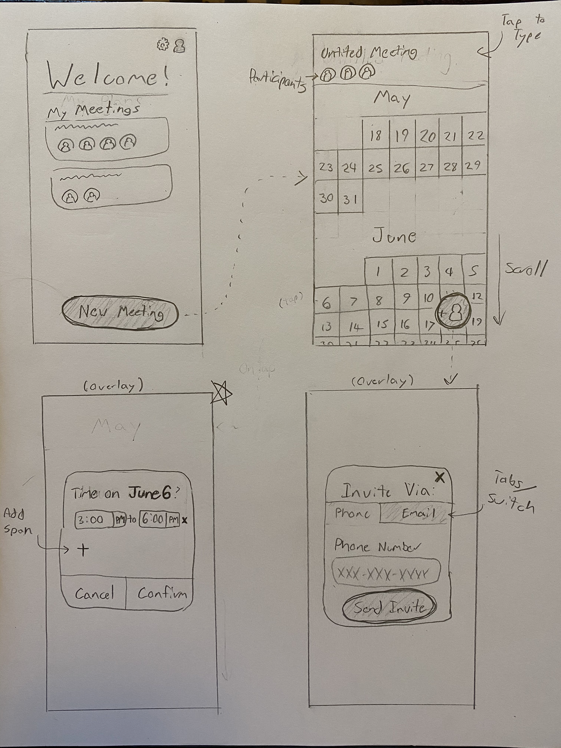
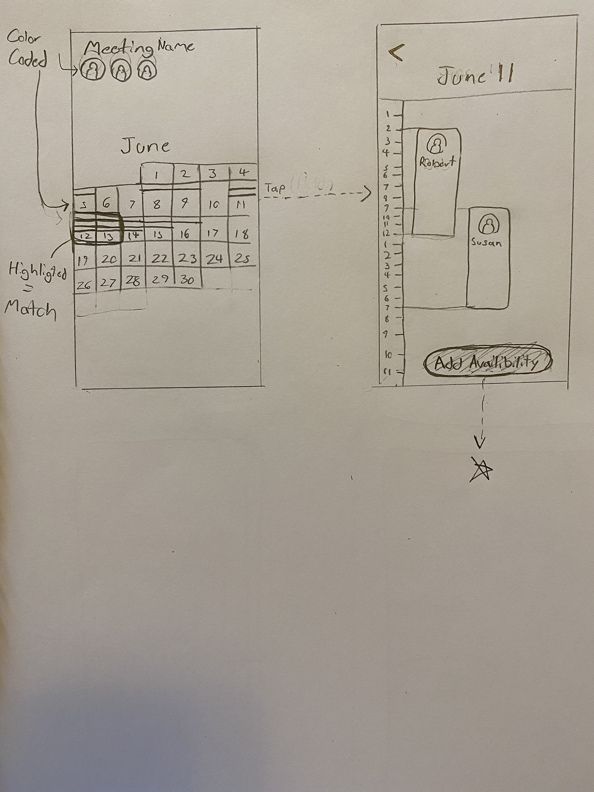
As I built upon these initial wireframe sketches to construct a mid-fidelity interactive prototype of PlanGo, I was informed by a variety of design principles:
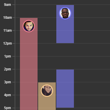
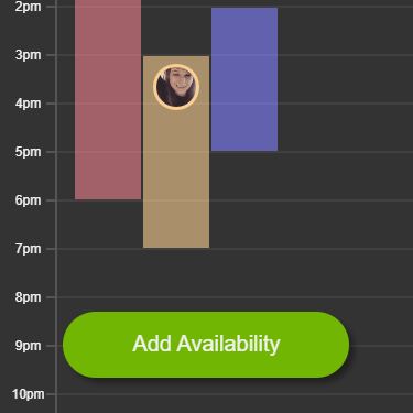
1. The color coding used to visually associate individual participants with their spans of availability demonstrates the principle of consistency, and allows users to easily track relationships across multiple screens.

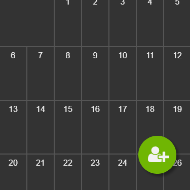
2. PlanGo’s branding's vibrant green is used to take advantage of the principle of highlighting, with its high visual contrast being used to draw the user’s attention to key interactions or important information on each screen.
3. All screens are designed to maximize signal to noise ratio by eliminating as much visual information as possible not explicitly necessary to user goals or to the interactions possible on that screen.
4. Similarly, iconic representation is employed in favor of text labels when possible, such as with the button for inviting participants, or the use of participant profile icons to label availability spans in the day view, in order to minimize visual clutter.
5. The flow for viewing assembled availability information for a plan follows the principle of progressive disclosure, first providing the user with more general information about which participants have availability on which dates on the calendar view, and then showing them each participant’s specific spans of availability when they select a day to view. This keeps the amount of information being displayed on any given screen to a more digestible level.

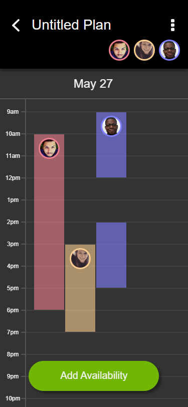
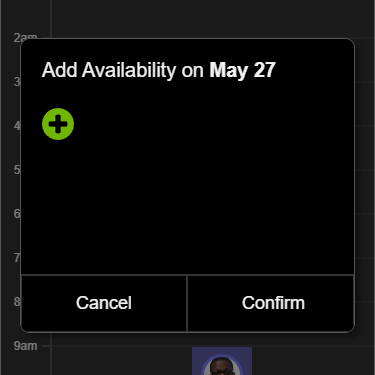
6. The designs of the screens for viewing specific availability spans on a given day, as well as for inputting availability, acknowledge the importance of recognition over recall by keeping the date in question consistently visible. This principle also informs the decision to keep the name of the plan being viewed visible at the top of all related screens.
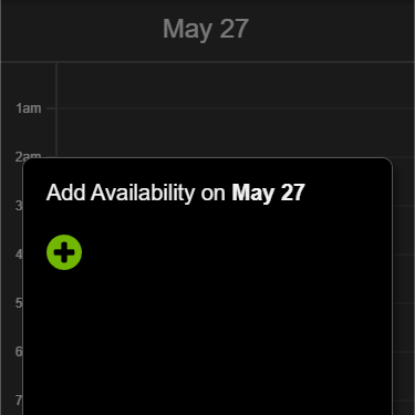
7. Users' ability to input their availability information is limited to the day view in an example of a flexibility-usability tradeoff. While it would be possible to implement a more flexible interaction wherein users could input availability for multiple days at once directly from the calendar view, it would require a much more complex and inevitably less usable interface.
8. This determination that a simpler and more usable solution is preferable to a more flexible yet more complex one is also informed by the principle of Occam’s razor.
9. The principle of mimicry is employed on several levels of PlanGo’s design in order to increase learnability and intuitiveness of use, such as the calendar view’s presentation mimicking the familiar shape and layout of a physical calendar, or the interface of both the calendar and day view’s resemblance to the Google Suite and Google Calendar apps already familiar to PlanGo’s target users.
10. This mimicry of familiar interfaces of the Google Suite in particular allows users already familiar with that software to quickly form a mental model of PlanGo, and understand what interactions are possible and what the results of their actions will be without even having used the tool before.
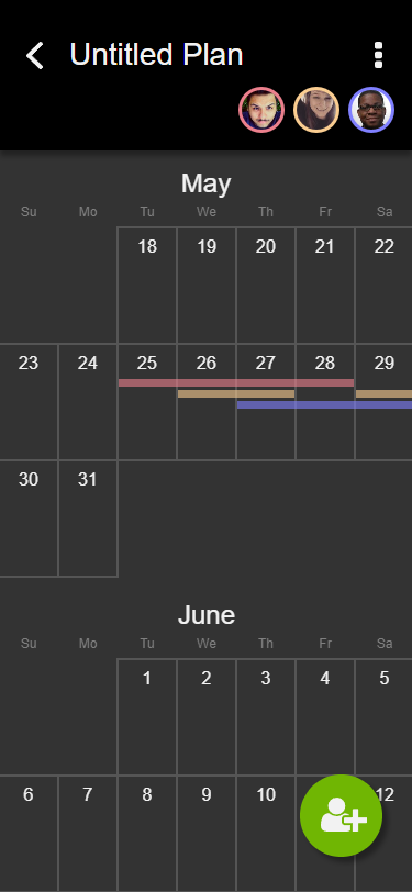

Calendar view, PlanGo (left) and Google Calendar (right).


Day view, PlanGo (left) and Google Calendar (right).
INTERACTIVE PROTOTYPE
The end product of my design process was a digital prototype of PlanGo demonstrating the following user tasks:
1. Create a new Plan.
2. Change the name of the newly created Plan.
3. Invite another participant to add their availability to the calendar.
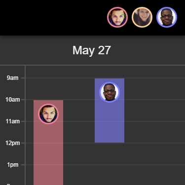
4. View other participants' availability on May 27.
5. Input your availability from 9:00am to 5:30pm on May 27.
Reflections
Overall, I consider the greatest strength of PlanGo’s design to be its use of familiar interface designs and idioms borrowed from other popular platforms offering superficially similar functionality, such as the Google Suite. Being that PlanGo is a tool for a specific and occasional task (organizing and making plans with groups of people), users will generally want to spend as little time using it as possible. Relying on familiar patterns and already established mental models supports this by maximizing ease of learnability.
I consider the greatest weakness of this prototype design to be its reliance on color-coding both to distinguish interface elements and to communicate its most important information to users: which participants are available and when. Colorblind users were not considered in the planning stage, and as such this poses a potentially significant accessibility issue. If I were to iterate on this design further, I might consider alternate solutions such as textured pattern fills to distinguish availability spans from one another, or small distinct geometric icons matching spans of availability to their corresponding participants.
Thanks for reading! ❤️