McDonald's Design System: Global Tabs Component
PROBLEM: In the absence of a global design system at McDonald's, visual and usability inconsistencies with tabs components across the brand's main digital channels (mobile app, ordering kiosk, and web) were undermining the company's goal of delivering a seamless cross-channel experience.
GOAL: Propose an update to existing tabs components that provides superior cross-channel consistency, scalability, and accessibility. Additionally: develop methods for designing and documenting new global design system components that can be standardized and adapted to accelerate future component design projects.
ROLE: Design System Intern, UI Designer.
TOOLS: Figma, Jira, UserZoom.
SCOPE/CONSTRAINTS: The project timeline spanned 10 weeks. The scope was purely visual; any changes to existing functionality, behavior or use cases were out of scope.
APPROACH: I began by conducting research to construct a formal system definition of tabs. I then performed an audit of all existing use cases across McDonald's digital channels in order to scope the requirements for my design. Next, I created screen mockups for several potential design solutions conforming to those requirements. Usability testing was performed to validate and compare the performance of each option in order to inform the selection of the final direction.
RESULTS: I delivered a new global tabs component design featuring cross-channel visual consistency and scalability. The design was informed by accessibility guidelines and user research data. The final design was thoroughly documented and annotated in preparation for hand-off to developers. The final tabs component and deliverables will become a pattern for designing future global design system components.
The project roadmap was split into 3 phases:
1. Propose (3 weeks)
2. Design (4 weeks)
3. Document (3 weeks)
1. Propose
DEFINING TABS
Before I could begin designing a new Tabs component for the McDonald’s design system, I first had to define exactly what a Tabs component is. I began attempting to answer this question by conducting comparative research of tabs component definitions among publicly available design system documentation. As I discovered, there exists a surprising amount of variety among definitions of “Tabs” components, even among the most influential design system references like Google’s Material Design and Apple’s Human Interface Guidelines.
My conclusion was that rather than being truly universal, a design system is a bespoke product tailoring its content and definitions to a defined range of expected use cases. My definition of tabs would therefore need to take into account both common conventions of how tabs are expected to behave as well as the specific needs of McDonald’s digital channels. Based on that background research as well as a review of the existing McDonald's design libraries, I formulated the following definition:
"Tabs are used to organize related and hierarchically parallel content by allowing users to alternate between multiple views of that content within a single section of a page."
I also supplemented that definition with an additional list of defined characteristics:
• Tabs appear in sets of at least 2.
• Tabs are arranged in a single row or column.
• Tabs contain descriptive labels related to their contents.
• Tabs can also contain icons.
• Tabs have active and inactive states.
• Each tab set has a default active tab.
• Only one tab in a set is active at a time.
• Tabs appear adjacent to the content area they modify.
• Tabs are distinct from navigation, and should not link to separate pages.
USAGE AUDIT
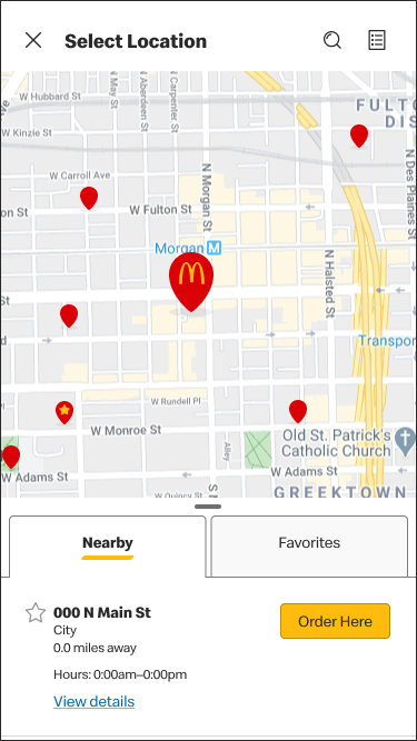
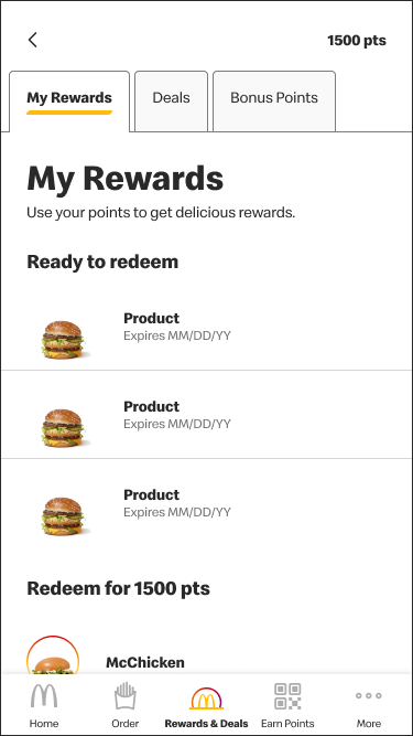
With "Tabs" clearly defined, I was able to conduct a thorough and comprehensive audit of all existing use cases of tabs across McDonald’s 3 main digital channels: mobile app, web, and ordering kiosk. I discovered 5 existing use cases: 4 on the mobile app, one on the ordering kiosk, and 0 on web. This simplified my task somewhat, as web would only have to be considered on a future-case basis. In the immediate term, I would only need to design for mobile and kiosk. Nevertheless, the two platforms did boast a considerable amount of variation to reconcile. Tab labels on kiosk featured icons, for example, while some tabs on mobile featured the ability to be transformed into a vertical list via a chevron icon below the set. A scalable global solution would have to accommodate all of these diverse cases in a logically consistent way.
Several preexisting instances of tabs with wildly different designs.
SCOPING REQUIREMENTS
With the audit completed, I was able to articulate the specific requirements that my new global tabs component design would need to meet. I broke these requirements down further into descending levels of priority:
Must:
• Possess active(selected) and inactive state.
• Meet accessibility requirements (contrast & legibility).
• Utilize design libraries/ tokens (color, space, type, etc)
• Support contextual transformation into a vertical list
Should:
• Feature consistent animation of transition from inactive to active states across channels.
Avoid:
• Using color alone to indicate active and inactive states (accessibility violation)
• Disabled states (targeted for depreciation)
2. Design
IDEATION & MOCKUPS
With the requirements for a new tabs design now clearly understood and defined, it was time to begin ideating potential solutions. I began by consulting the research I had already done into other existing design system examples, as well as designs already in use across McDonald’s digital channels.
Ideation converged on 3 potential visual styles, which I dubbed "underline", "border", and "skeuomorph". Since the stated objective of this project was to create design consistency, each style was based at least in part on an existing design within the McDonald’s design libraries. In addition, I identified 3 potential color options to indicate active states (gold, red, and black) for a grand total of 9 possible variants.
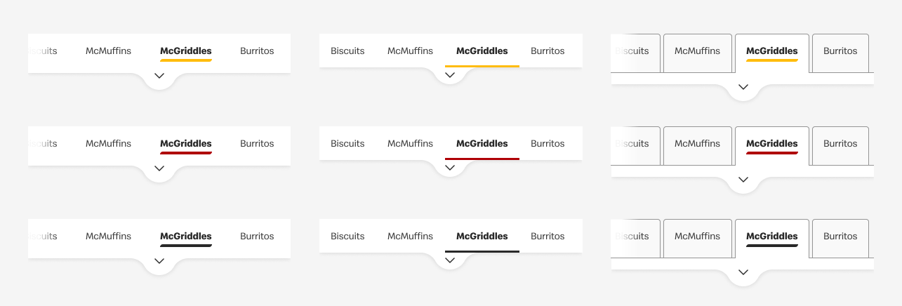
From right to left: "border", "underline", and "skeuomorph" designs.
USER TESTING
Rather than arbitrarily deciding which combination of visual styling and color to move forward with, I collaborated with McDonald’s own in-house UX research team to conduct a study comparing their relative performance and reception with real users.
Due to constraints of both time and budget, testing was performed remotely and asynchronously with users recruited via the UserZoom research platform. 200 participants were recruited in total, 100 on desktop, and 100 on mobile.
Participants were screened for:
🍔 Being residents of the United States
🍟 Self-reporting that they had ordered from McDonald’s within the past month.
This screening was done in order to increase the speed at which the study could be deployed by limiting its scope. In addition, by assuming some familiarity with the current design of McDonald’s digital channels, the tests could focus as much as possible on gauging the impact of the design changes.
The study itself consisted of two sections:
1. Signal Testing
Users were presented with a screen mockup of the McDonald’s mobile app featuring one of the tabs design and color combinations, along with the prompt, “Imagine you’re using the McDonald’s mobile app to make an order. Please click on the area of the screen that indicates the food category that’s currently selected.”
The percentage of users who clicked the area of the screen corresponding to the active tab in the tab set was then used to gauge the relative performance of each design and color combination.
2. Color Visibility Comparison
Users were presented with three different screen mockups of the McDonald’s mobile app featuring the same visual direction in all color variations, and were prompted to answer the multiple choice question: “Which of the following is easiest to see what category was selected?”
Users had the option of choosing any of the 3 options shown, or instead to indicate that they believed the visibility of all options to be about the same.
TESTING RESULTS
Signal testing results revealed two clear trends. Among the color options, black variants consistently had the highest success rate, followed closely by gold, and with red at a relatively distant third. As for the visual styles, "skeuomorph" had the highest success rate narrowly edging out "border", while "underline" lagged in third.
Color visibility comparison curiously revealed a trend totally contrary to signal testing. Though the majority of respondents indicated that they felt each of the color options were about equally visible, those that did indicate a preference overwhelmingly chose either gold or red, leaving black dead last. This might represent a good teaching example of the UX principle that users cannot be relied upon to accurately recall or estimate their experience using a product. It might also point to a fundamental inconsistency in the effectiveness of black as an active state indicator color depending on the context or intent of use.

Heatmap view of signal testing responses.
DECISION
Armed with the data and insights gleaned from user testing, it was time to make a final decision on the visual design of the new global tabs component.
Starting with active state indicator color, black's inconsistent testing performance and red's potentially problematic association with error states when used as a UI accent made gold the clear best choice despite its low contrast ratio with a white background of only 1.68:1. This potentially significant accessibility concern could be overlooked in this case due to the presence of a secondary visual indicator for active states: increased font weight.
Choosing the style would be more complicated. In order to do so, I assembled a list of pros and cons for each candidate design. These included relative testing performance as well as other design considerations such as overall visual consistency with other existing interface components and/or compatibility with existing or planned functionality.
The following visualization lumps these later considerations into a single "impact" axis, where "small impact" indicates that a design can be easily swapped in for the existing design with minimal need for other interface or interaction design changes, while "big impact" signals the opposite. With user testing performance mapped to the other axis, each design presents as having nuanced advantages and drawbacks.

However, organizing my thoughts this way made clear that the "skeuomorph" style offered the best of both worlds in terms of validated usability and ease of implementation appropriate for this project's limited scope.
✨Skeuomorph, with gold coloring, is the winner!✨
FINAL COMPONENT
With the visual direction of the design now decided, it was time to flesh out that concept into a comprehensive and scalable design system component. To borrow a phrase of McDonald’s lingo: my approach was to “think global, act local”. In other words, I first conceived of the component in a contextually-agnostic way, simultaneously accommodating all potential use cases, and created the individual variations for each use case by subtraction rather than addition.
The component itself was built out in robust atomic fashion within Figma, utilizing individual tab molecules whose states could be set independently. Component variants controlled the number of tabs in the set, their layout, and occasionally contained preconfigurations for specific use-cases (e.g., disabled). In short, my new tabs component empowered future designers at McDonald's to continue to prototype and iterate new designs with greater ease than ever before.

The new global tabs component in several example states.
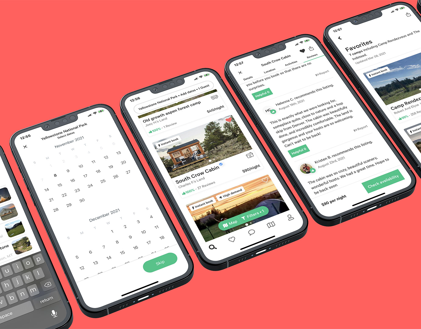
Several screen mockups featuring the new tabs design!
3. Document
DESIGN ANNOTATIONS
With the final design confirmed, the last major step of the project was to fully document the design for handoff to developers. This included providing a clear itemized inventory and annotations noting all design tokens referenced in the component design. As the design system’s token library was not actually built at the time of this project, the annotation format and style had to be conceived from scratch. Though this initial pass may be subject to future revision, it serves as proof of concept and a launching point for future work as McDonald's global design system takes shape.
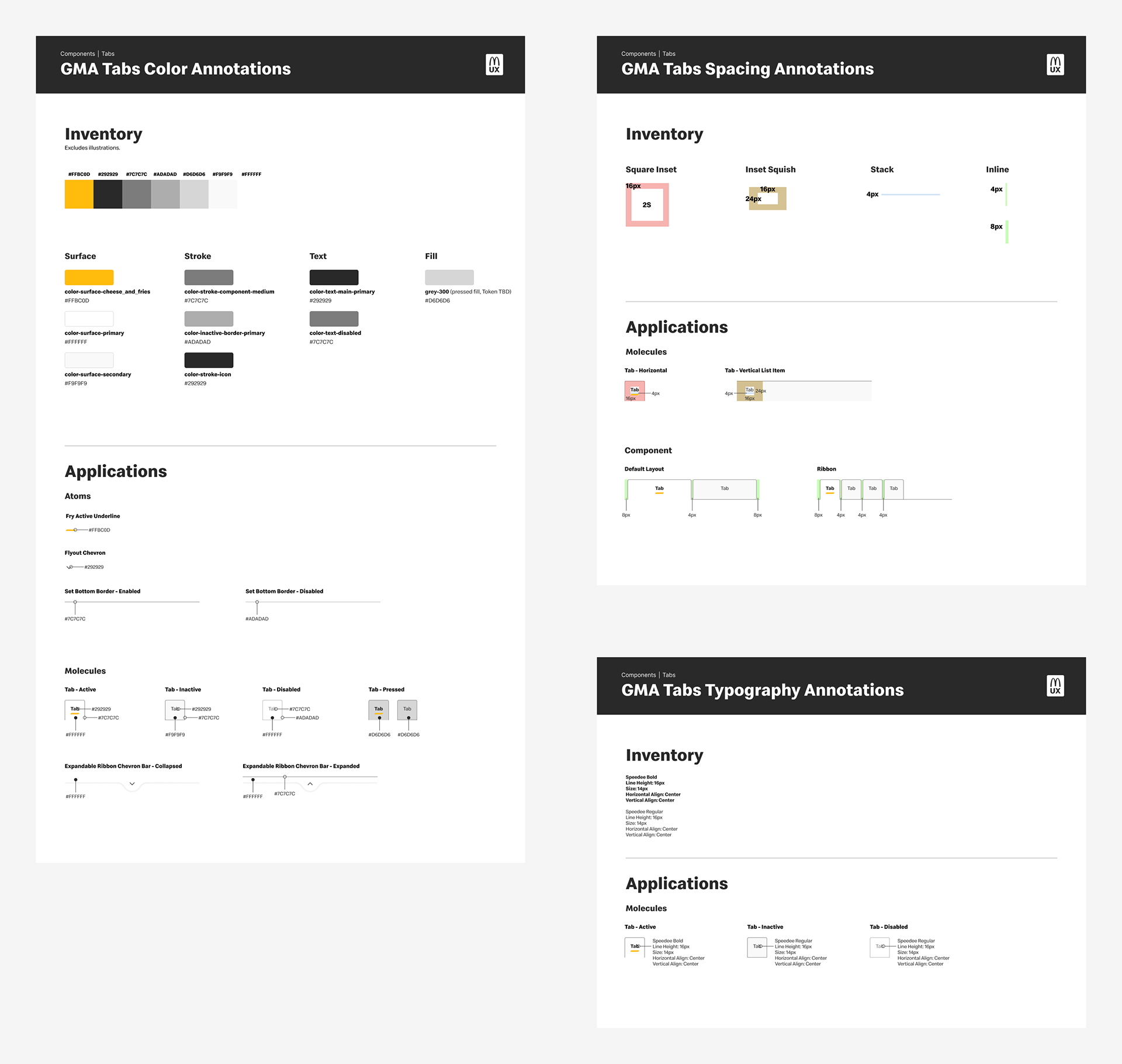
A small sample of the tabs component design annotations.
DOCUMENTATION
In addition to visual design annotations, I also wrote copy for use in a future publicly available McDonald’s design system guidelines site. This documentation was intended for a less technical audience; it communicated the why and how of using tabs in an interface to readers who may be totally new to design. As the McDonald's global design system itself is still in its early stages, it may be a while before this content sees the light of day. Nevertheless, what I accomplished here is the first step towards that becoming reality.
Reflections
Overall, I’m extremely proud of what I was able to accomplish with this project. Not only did I design and deliver a design which creates visual consistency across McDonald’s digital channels: I did so validated by data and feedback from real users.
However, there are areas where I would have liked to have done more had time and/or budget constraints allowed:
📝 Additional user testing could be done specifically with users with disabilities. This would make it possible to judge whether and to what extent the design is inclusive, rather than simply whether it meets the baseline requirements for accessibility.
📝 Explorations of functional changes to how tabs are currently implemented or behave within McDonald’s current digital channels. The scrollable ribbon tabs currently employed on the mobile app, for example, pose multiple usability and accessibility issues inherent to their function. More holistic future examinations of these interfaces could explore replacing these tabs with a different and more appropriate interface component.
Thanks for reading! ❤️